


US Interest Rates Are Rising Again, and China Has Stopped Exporting Falling Prices

US interest rates are rising again. The Federal Reserve raised its policy rate on 16 September 2026 and the 10-year Treasury yield passed 5 per cent, while China's factory prices, its currency and the price of its exports all turned up. Oil is still the larger driver of US inflation. The eight market series, what the data says, and what it means for an ASX investor.


The US Federal Reserve raised its policy rate on 16 September 2026, the first rise since 2023. Two weeks later, on 30 September, the US 10-year Treasury yield closed at 5.29 per cent, its highest close since May 2002. A bond yield is the annual return for lending money to a government, and the US 10-year yield is the reference price for money around the world. Those two numbers feed into the price of most Australian assets, from the Australian dollar to a gold explorer's share price.
This is the first Global Markets edition from Samso, and Part 3 of the China series. For most of the last three years China sold its goods to the world at falling prices, which tended to hold down goods inflation in the countries that bought them. In 2026 China's factory prices turned positive in March, its currency, the yuan, has strengthened, and the price the US pays for Chinese goods is now rising. Oil is still the larger force behind US inflation, and goods from China are rising more slowly than US imports as a whole.
A NOTE ON THE VOCABULARY AND THE REFERENCES Every market term in this piece is explained in plain English where it first appears. The same terms are collected in one box at the back, above the references, for anyone who wants to look one up again. Each source carries an identifier, [R1] to [R32]. The identifier appears in the text where the source is used and again at the head of its entry in the reference list, so any number can be traced to the document behind it. In the online version the identifier is a link. The cover photograph is credited at [R32]. |
READING THE SERIES Part 1. Japan Took 30 Years to Recover. China May Not Get the Same Chance. The macro case. Japan's precedent, China's property crisis, its debt, its falling population and the tension between AI and jobs. Part 2. China Is Slowing. The Money Went to What China Controls. Where the capital went. Iron ore against tungsten, tin and copper, and the ASX and TSX producers on either side of China's role in each market. Part 3. This piece. China's part in US interest rates and global inflation, read through the eight market series. |
WHAT THIS PIECE COVERS 1.00 What moved this fortnight The eight series, their latest values and the change over two weeks. 2.00 The Federal Reserve decision What the Fed did on 16 September, what a bond yield is, and what the committee expects next. 3.00 Why the US 10-year is above 5 per cent The yield split into its real and inflation parts, and which part did the rising. 4.00 Oil and the inflation numbers Brent crude, the Strait of Hormuz and the gap between headline and core inflation. 5.00 China's factory prices turn positive China's producer prices and what the US now pays for Chinese goods. How a stronger Chinese currency feeds into the price of goods abroad. 7.00 China's oil stockpiles and US Treasury holdings Two other ways China reaches US rates, and what the data does and does not show. 8.00 What the market is arguing about Three claims from the commentary this fortnight, checked against the numbers. A walk through six charts, what each one has done and the pathways it allows. 10.00 What it means for an ASX investor The yield spread, the Australian dollar, the RBA and the resources sector. Samso view. |
1.00 — WHAT MOVED THIS FORTNIGHT
Eight market series and their two-week change
Samso follows the same eight market series every fortnight, in the same order, so the edition can be read the same way each time. Table 01 gives the latest value of each and the value two weeks earlier. FIG. 01, after the table, shows the last twelve months of each series.
![TABLE 01. The eight series, latest value against two weeks earlier. Columns: Series, Latest, Two weeks earlier, Change, Source and date. Series US 10-year Treasury yield; Latest 5.24%; Two weeks earlier 4.94%; Change +0.30 pts; Source and date FRED DGS10, 1 Oct vs 17 Sep. Series Australian 10-year bond yield; Latest 5.34%; Two weeks earlier 5.35%; Change 0.00 pts; Source and date RBA F2, 30 Sep vs 16 Sep. Series Spread, Australia minus US; Latest +0.05 pts; Two weeks earlier +0.34 pts; Change −0.28 pts; Source and date Samso calculation, 30 Sep vs 16 Sep. Series AUD/USD; Latest 0.6929; Two weeks earlier 0.7115; Change −2.6%; Source and date Yahoo Finance AUDUSD=X, 2 Oct vs 18 Sep. Series Brent crude, spot; Latest US$113.96; Two weeks earlier US$130.80; Change −12.9%; Source and date FRED DCOILBRENTEU, 29 Sep vs 15 Sep. Series Copper, COMEX front month; Latest US$6.55/lb; Two weeks earlier US$6.61/lb; Change −1.0%; Source and date Yahoo Finance HG=F, 2 Oct vs 18 Sep. Series Gold, COMEX front month; Latest US$4,162.30; Two weeks earlier US$4,424.90; Change −5.9%; Source and date Yahoo Finance GC=F, 2 Oct vs 18 Sep. Series ASX 200, rebased; Latest 99.5; Two weeks earlier 100.0; Change −0.6%; Source and date Yahoo Finance ^AXJO, 2 Oct vs 18 Sep. Series S&P 500, rebased; Latest 112.6; Two weeks earlier 111.5; Change +0.9%; Source and date FRED SP500, 2 Oct vs 18 Sep. Source and notes: Rebased means both indices are set to 100 on 2 January 2026. Each series is published on its own timetable, so the latest dates differ. The RBA bond table runs to 30 September. The spot Brent price for 15 September was a one-day peak, which makes its two-week fall look larger. Kitco quoted spot gold at US$4,139.80 an ounce at 5.00 pm New York time on 2 October [R19] . The copper and gold values are futures prices from COMEX, the New York metals exchange. A futures price is a price agreed today for delivery at a later date, and the front month is the contract due soonest.](https://static.wixstatic.com/media/8d6c37_67ccc17de9ed471aba60c1a42013174e~mv2.jpg/v1/fill/w_980,h_1121,al_c,q_85,usm_0.66_1.00_0.01,enc_avif,quality_auto/8d6c37_67ccc17de9ed471aba60c1a42013174e~mv2.jpg)
The US 10-year yield rose 0.30 percentage points in two weeks [R4]. The Australian 10-year was flat [R9], so the gap between the two narrowed to almost nothing. The Australian dollar fell 2.6 per cent against the US dollar, copper slipped and gold fell 5.9 per cent [R20]. Spot Brent came down from a spike in mid-September to US$113.96 [R7]. The ASX 200 is now slightly below where it started the year, while the S&P 500 is more than 12 per cent above it [R22].

The two bond yields describe the price of borrowing money for ten years in each country. AUD/USD is how many US dollars one Australian dollar buys, and it tends to move with the spread. Brent is the price of oil, which runs into fuel, freight and mining costs. Copper is read as a measure of industrial demand. Gold is bought as a store of value in uncertain times, and it tends to fall when real interest rates rise, as section 3.00 explains. The two share indices show whether the ASX is keeping pace with the US market.
2.00 — THE FEDERAL RESERVE DECISION
The first US rate rise since 2023
The Federal Reserve is the US central bank. Its Federal Open Market Committee, the FOMC, sets the federal funds rate, which is the rate banks charge each other to borrow overnight. Almost every other interest rate in the US economy is priced off it. PLATE 01 shows the building in Washington where the committee meets [R31].

On 16 September 2026 the committee voted 12 to 0 to raise the target range by a quarter of a percentage point, to 3.75 to 4.00 per cent [R1]. Its statement described economic activity as expanding at a solid pace and said that "Inflation remains elevated." It said the rise supports "a timelier return to the Committee's 2 percent goal" [R1].
The committee also published its Summary of Economic Projections, the forecasts each member makes each quarter. The median member expects the federal funds rate to finish 2026 at 4.1 per cent [R2]. The midpoint of the current range is 3.875 per cent, so a finish at 4.1 per cent implies one more quarter-point rise before the end of the year. The median expects the rate to stay at 4.1 per cent through 2027. That is Samso's reading of the published median, not a statement the committee made.
The same projections put the committee's preferred inflation measure, the personal consumption expenditures price index or PCE, at 3.7 per cent for 2026 and 2.3 per cent for 2027 [R2]. In June the median member had expected the funds rate to finish 2026 at 3.8 per cent [R2].
At the press conference the Chair, Kevin Warsh, declined to say where rates go next. "I'm not in the forward guidance business," he said [R3]. He also said the Fed cannot affect any individual price such as oil or food, and that its job is to stop a rise in those prices spreading into everything else [R3]. The transcript published by the Fed carries no mention of China.
A bond is a loan to a government or a company. The yield is the annual return the lender earns for making it. When buyers demand a higher return to hold a bond, its price falls and its yield rises. A US Treasury is a loan to the US government. Mortgages, company loans and the value of shares are all priced with reference to its yield.
FIG. 02 sets the federal funds rate against the 2-year and 10-year Treasury yields. The 2-year yield trades mostly on where the market expects the Fed to take its rate over the next two years. It rose from 3.38 per cent at the end of February to 4.67 per cent on 15 September, the day before the decision, and was 4.78 per cent on 1 October [R4]. The market had priced the rise before the committee made it.

The yield curve is the line of yields across different terms, and its slope here is the 10-year yield minus the 2-year yield. On 2 October it was 0.45 percentage points [R4]. A positive slope means investors want more to lend for ten years than for two. For most of 2023 and 2024 the slope was negative, which means the 2-year yield was above the 10-year.
3.00 — WHY THE US 10-YEAR IS ABOVE 5 PER CENT
Real yields drove most of the rise
A nominal yield is the one quoted on the screen. It can be split into two parts. The first is the real yield, which is the return after inflation. The second is breakeven inflation, which is the rate of inflation the bond market expects over the life of the bond.
Both parts can be read from the market. The US government issues Treasury Inflation-Protected Securities, called TIPS, whose repayments rise with inflation. The yield on a TIPS bond is the real yield. The gap between an ordinary Treasury yield and a TIPS yield of the same term is the breakeven inflation rate [R5].

FIG. 03 shows the split since the start of 2024. The US 10-year yield rose from 3.97 per cent on 27 February 2026 to 5.24 per cent on 1 October, a rise of 1.27 percentage points [R4]. Over the same dates the 10-year real yield rose from 1.72 to 2.88 per cent, which is 1.16 points. The 10-year breakeven moved from 2.25 to 2.36 per cent, which is 0.11 points [R5].
On those figures about nine tenths of the rise in the 10-year yield came from the real yield. That is Samso's arithmetic. FRED builds the breakeven series as the nominal yield minus the real yield, so the two parts add up to the nominal yield exactly.
The bond market's long-run inflation expectation has barely moved, and at 2.36 per cent on 2 October it is close to its level for most of the last three years [R5]. The rise came from the real yield, the return investors want for lending money after inflation. It reached 2.93 per cent on 30 September, the highest on this chart, and was 2.88 per cent on 1 October.
There are several reasons a real yield rises. Investors may expect the Fed to hold rates high for longer. They may want more compensation for the uncertainty of lending for ten years, which is called the term premium. Or there may be more government bonds to buy than buyers at the old price. FIG. 03 cannot separate these causes. It shows that most of the 2026 rise in the 10-year yield is in the real yield, and that inflation expectations have barely moved.

4.00 — OIL AND THE INFLATION NUMBERS
An oil shock in the headline number, not yet in the core
Brent crude is the main global oil benchmark. It is priced in US dollars and it feeds into fuel, freight, fertiliser and the running costs of most mines and farms. That is why it shows up in the cost base of companies that have nothing to do with oil.
Brent spot opened 2026 at about US$62 a barrel. It rose to US$138.21 on 7 April and was US$113.96 on 29 September [R7]. The rise followed the start of the conflict with Iran in early 2026 [R16]. The US Energy Information Administration, the EIA, says flows through the Strait of Hormuz and the Bab el-Mandeb strait remain constrained. Oil production that is shut in has been stopped at the well because it cannot be shipped. In its September outlook the EIA put that at 6.7 million barrels a day in August and expected an average of 5.7 million a day in the fourth quarter of 2026 [R15].
There are two Brent prices in this piece and they differ. The spot price is what a cargo of oil sells for now. The futures price is an agreement today on the price of oil delivered in a later month. On 2 October the front-month Brent future closed at US$102.25 [R20], well below the spot price three days earlier. When oil for delivery now costs more than oil for delivery later, the market is paying a premium for barrels it can get immediately. Traders call this backwardation. It usually means buyers are short of oil now.
FIG. 04 sets US consumer prices against the oil price. The consumer price index, the CPI, measures the change in the price of a basket of goods and services. The headline rate includes everything. The core rate leaves out food and energy, which move most, to show the underlying trend.

US headline CPI inflation rose from 2.66 per cent in February 2026 to 4.27 per cent in May, then eased to 3.71 per cent in August. Core inflation was 2.76 per cent in August and has stayed between 2.67 and 2.99 per cent all year. Both rates are Samso's calculation from the Bureau of Labor Statistics index levels [R6]. The Fed's preferred core measure, core PCE, was higher at 3.0 per cent in August [R6].
On Samso's reading of the gap between the two rates, the oil shock is in the headline number and has not yet spread into the core. That spread is what Chair Warsh said the Fed exists to prevent [R3]. Samso reads the September rise as the committee acting before it happens.
The EIA expects Brent to average about US$90 a barrel in the second half of 2026, US$77 in the second quarter of 2027 and US$67 in the second half of 2027. The EIA expects this as production restarts and stockpiles are rebuilt [R15]. That forecast rests on flows recovering gradually through pipelines and other routes. Spot Brent is already well above the EIA's second-half average.
Australia is in the same position. The ABS monthly CPI showed prices up 4.0 per cent in the year to August, from 3.5 per cent in July, with a trimmed mean of 3.6 per cent [R10]. A trimmed mean is the RBA's preferred underlying measure. It drops the items with the largest rises and falls each month and averages the rest. Automotive fuel rose 14.8 per cent in August alone, after 7.5 per cent in July [R10]. The Reserve Bank of Australia, the RBA, sets the cash rate, Australia's equivalent of the federal funds rate. It raised the cash rate in February, March and May 2026, and again on 29 September, to 4.60 per cent [R23].
5.00 — CHINA'S FACTORY PRICES TURN POSITIVE
China's factory prices are rising, led by energy and raw materials
A producer price index, the PPI, measures the prices factories receive for what they make, before any retailer adds a margin. China's National Bureau of Statistics publishes one every month. For most of the three years to early 2026 China's PPI fell year on year. China Daily reported that the March 2026 figure ended 41 months of decline [R24], which is a report of the count rather than a figure Samso has checked at source.
Falling factory prices in China meant buyers abroad could pay less each year for many manufactured goods. Economists often describe this as China exporting deflation. The US import price index in FIG. 05 shows the effect in the price the US paid. Part 1 of this series set out why China's economy produced that result, in its property crisis, its debt and its falling population.
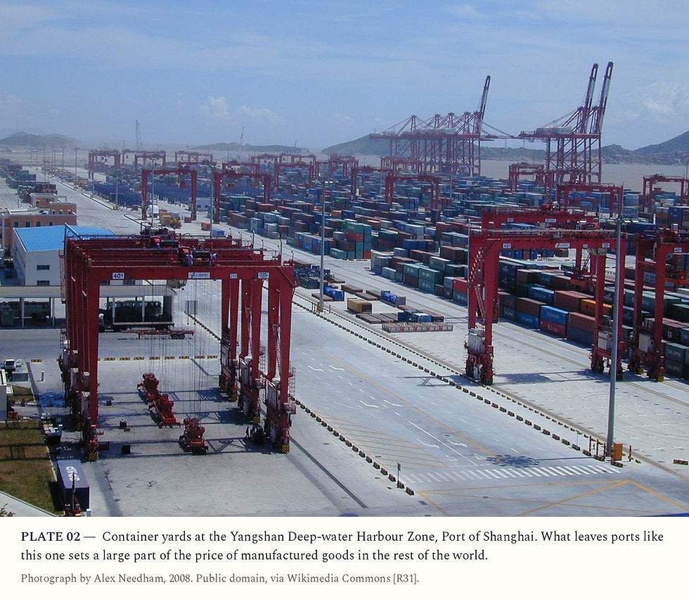
PLATE 02 shows one end of that trade, the Yangshan container terminal at the Port of Shanghai. FIG. 05 shows what changed in 2026. China's PPI was minus 0.9 per cent in February and turned positive in March at 0.5 per cent. It reached 4.1 per cent in June and was 3.8 per cent in August [R12].

The NBS breakdown for August shows where the rises are. Mining and quarrying prices were up 17.8 per cent on a year earlier, coal mining up 26.6 per cent and petroleum and natural gas up 10.5 per cent. Consumer goods prices were still down 0.5 per cent [R12]. Much of the turn is therefore energy and raw materials coming through China's factories, not a broad rise in the price of what China sells to households.
The US side of the trade is measured directly. The US Bureau of Labor Statistics publishes an index of the prices the US pays for imports from China. On Samso's calculation from that index, prices of goods from China fell 3.4 per cent in the year to August 2025. They rose 3.1 per cent in the year to August 2026, the fastest rise since mid-2022 [R13]. Prices of all US imports rose 6.8 per cent over the same year, so goods from China are still rising more slowly than imports as a whole.
Consumers in China are not yet seeing much of it. China's CPI rose 0.8 per cent in the year to August and core CPI 1.0 per cent [R11]. Those are low numbers by the standard of most large economies. The pressure is at the factory gate and in the export price, which is where it reaches the rest of the world first.
On the BLS index, goods from China are no longer getting cheaper for US buyers. They are getting dearer, more slowly than imports from elsewhere.
6.00 — THE YUAN
A stronger yuan raises the dollar price of Chinese goods
The price the US pays for a Chinese good depends on two things, the factory price in yuan and the exchange rate. The yuan has been rising. FIG. 06 shows it at 7.30 to the US dollar at the end of 2024 and 6.71 on 25 September 2026 [R8]. On Samso's arithmetic that is a strengthening of about 9 per cent.

A 9 per cent stronger yuan means a Chinese exporter who keeps its yuan price unchanged is charging an American buyer about 9 per cent more in dollars. Exporters can absorb some of that in their margins, which may be one reason US import prices from China have risen by less.
The Bank of Finland's Institute for Emerging Economies, BOFIT, tracks the yuan closely. In May it said the currency had strengthened 3 per cent against the dollar in 2026. It put that down to strong exports, a large current account surplus and a weaker US dollar at the time [R17]. A current account surplus means China earns more from the rest of the world than it pays out. It also said the People's Bank of China manages the rate through a daily reference rate with a band of 2 per cent either side, and through guidance to state-owned banks. BOFIT cited an estimate from the International Monetary Fund, the IMF, that China's real effective exchange rate was undervalued by 12 to 21 per cent in 2025 [R17]. That is as reported by BOFIT rather than read from the IMF document. A real effective exchange rate measures a currency against a basket of trading partners, adjusted for inflation.
If that estimate is close, the yuan could rise further before reaching what the IMF considers fair value, and each step would add to the dollar price of Chinese goods. Whether Beijing lets it rise is a policy decision. BOFIT notes that the PBoC has tools to slow the yuan's gains, and cites a February change that made it cheaper for banks to buy dollars forward [R17].

7.00 — CHINA'S OIL STOCKPILES AND US TREASURY HOLDINGS
China's oil reserves and its US Treasury holdings
China reaches US interest rates in two more ways. The first is oil. Alicia García-Herrero at the Brussels think tank Bruegel wrote in March that about half of China's crude imports come through the Persian Gulf. She put China's strategic and commercial reserves at roughly 1.3 to 1.4 billion barrels, about four months of imports [R16]. She also reported that China's crude imports rose 16 per cent in January and February 2026 as it built stocks ahead of the conflict [R16].
A buyer with four months of stock can stop buying for a while. When China draws down its reserves instead of buying cargoes, it takes demand out of a tight market and holds the price down for everyone else. When it starts buying again, it adds that demand back. China's monthly customs figures for crude imports could not be read at source for this piece, so Samso has not stated what China bought in September.
Through that mechanism China's stockpile decisions feed into the oil price, and the oil price feeds into US headline inflation, which the Fed is responding to.
The second channel is the US bond market itself. The US Treasury records who holds its debt through the Treasury International Capital system, called TIC. FIG. 07 shows mainland China's recorded holdings.

China held US$1,316.7 billion of Treasuries at its peak in November 2013. In July 2026 it held US$618.0 billion, down US$77.6 billion on a year earlier [R14]. Total foreign holdings were US$9,248.1 billion in July 2026, up US$138.6 billion on a year earlier [R14]. Holdings recorded against the United Kingdom, Belgium and Luxembourg rose over the same year.
There are limits to what these figures show. TIC records holdings by the country of the custodian, the bank that holds the bonds, so bonds China holds through an account in Belgium are recorded against Belgium. The recorded figure may understate China's real position. The data also does not show that China's selling has pushed US yields up. What it shows is that the largest foreign lender to the US government in 2013 now holds less than half as much, and that the US depends more on other buyers.
THE CASE AGAINST CHINA AS THE DRIVER On the gap between headline and core inflation, oil has done more to lift US inflation in 2026 than China has, and the oil shock began with a war, not with Chinese policy. US core inflation has barely moved. Goods from China are also rising more slowly than US imports as a whole, 3.1 per cent against 6.8 per cent in the year to August [R13]. On that measure China is still pulling US import inflation down relative to other suppliers. China's producer prices also moved month to month. The index fell 0.7 per cent in July alone before rising again in August [R12]. A turn that is mostly energy and raw materials could reverse as quickly as it came if the straits reopen and oil falls towards the EIA's 2027 forecast. The rise in US yields is mostly the real yield. That has more to do with the Fed, the supply of US government debt and the term premium than with the price of goods from China. |
8.00 — WHAT THE MARKET IS ARGUING ABOUT
The 1970s comparison, the Fed's next move and China's role
Three arguments ran through the financial commentary in the fortnight to 2 October. Each is set against the primary data below.
The comparison with the 1970s
The comparison is to a decade when an oil shock fed into wages and prices for years. The data does not support it yet. US core CPI is 2.76 per cent [R6]. The bond market's 10-year inflation expectation is 2.36 per cent [R5]. On the same BLS series, core inflation passed 10 per cent in 1974 and again in 1979 [R6]. Both periods had an oil shock and a central bank raising rates in response. In the 1970s the rise spread into core prices, which has not happened in 2026.
Whether the Fed has further to go
The committee's median puts the federal funds rate at 4.1 per cent at the end of 2026 and of 2027 [R2]. On Samso's reading that is one more quarter-point rise this year and none next year. The 2-year Treasury yield is 4.78 per cent [R4], above the 4.1 per cent path in the median projection. A 2-year yield above the expected policy path means the market is either pricing more rises than the committee expects, or asking for extra return to cover the uncertainty. The yield curve alone cannot say which. The Chair has declined to give guidance either way [R3].
Whether China is behind the inflation
Some of this holds up. China's factory prices have turned positive, the yuan is stronger, and the US now pays more for goods from China than a year ago [R12] [R13]. But US import prices from China rose 3.1 per cent over the year while all US imports rose 6.8 per cent. China is no longer lowering US import prices, and its goods are rising less than imports overall.
9.00 — READING THE CHARTS
What a technical trader sees on six charts
Technical analysis reads what a price has done, rather than what a company or an economy is worth. Samso uses it to describe a chart, not to call a trade. Nothing in this section is a buy or sell signal, a target or a level to act on. FIG. 08 to FIG. 13 below run from March 2025 to 2 October 2026 and use daily closing prices from Yahoo Finance [R20]. Table 02, just below, adds measurements taken from the same prices on 2 October.
The sections before this one set out the case that US real yields have risen, that oil is still the larger driver of inflation, and that China is no longer pushing goods prices down. The charts show whether markets have moved in line with that case. They cannot show on their own what caused the moves. Each chart below covers why it matters to the argument, what it shows and what it means for an Australian investor.
Each chart shows the daily close with two moving averages. A moving average is the average closing price over a set number of recent trading days. Traders use the 200-day average to separate a long uptrend from a long downtrend, and the 50-day average to do the same over a few months. The dots mark the highs and lows the text walks through. A trader reads a chart first by those turning points. A run of higher highs and higher lows is an uptrend. A run of lower highs and lower lows is a downtrend. Highs and lows at about the same levels make a range. That definition comes from Dow Theory. Robert Edwards and John Magee set it out, with the classic chart patterns, in Technical Analysis of Stock Trends, 1948 [R25].
![TABLE 02. Six charts measured on 2 October 2026. Columns: Market, Last, vs 200-day, 200-day direction, vs 10-day EMA, RSI, ADX, Channel position. Market US 10-year yield; Last 5.28%; vs 200-day +18.6%; 200-day direction Rising; vs 10-day EMA +1.9%; RSI 74.6; ADX 40.9; Channel position Near 20 and 55-day highs. Market AUD/USD; Last 0.6929; vs 200-day −1.4%; 200-day direction Rising; vs 10-day EMA −1.2%; RSI 24.5; ADX 36.0; Channel position Near 20 and 55-day lows. Market Brent, front-month future; Last US$102.25; vs 200-day +16.5%; 200-day direction Rising; vs 10-day EMA −0.8%; RSI 53.7; ADX 22.9; Channel position Inside, mid-range. Market Copper, COMEX future; Last US$6.55/lb; vs 200-day +7.1%; 200-day direction Rising; vs 10-day EMA −0.4%; RSI 48.8; ADX 10.7; Channel position Inside, mid-range. Market Gold, COMEX future; Last US$4,162; vs 200-day −8.6%; 200-day direction Flat; vs 10-day EMA −2.0%; RSI 34.1; ADX 19.4; Channel position Near 20-day low. Market S&P/ASX 200; Last 8,682; vs 200-day −1.6%; 200-day direction Flat; vs 10-day EMA −0.3%; RSI 40.7; ADX 25.1; Channel position Near 20 and 55-day lows. Source and notes: Yahoo Finance daily prices to 2 October 2026 [R20], measured by Samso with the Samso Technical Trading Expert method. These are the same prices charted below in FIG. 08 to FIG. 13. The US 10-year yield here is Yahoo's ^TNX close for 2 October, a day later than the 5.24 per cent FRED figure in Table 01. "200-day direction" is the change in the 200-day average over the last 20 sessions. Rising means above 0.5 per cent. Flat means between minus 0.5 and plus 0.5 per cent. The channel is the highest high and lowest low of the last 20 and 55 sessions.](https://static.wixstatic.com/media/8d6c37_25c5372202124abf8bf626f5fa5d04bf~mv2.jpg/v1/fill/w_980,h_903,al_c,q_85,usm_0.66_1.00_0.01,enc_avif,quality_auto/8d6c37_25c5372202124abf8bf626f5fa5d04bf~mv2.jpg)
Table 02 sets out where each of the six charts stood on 2 October. The US 10-year yield, Brent and copper trade above a rising 200-day average. Gold and the ASX 200 trade below a flat one. The Australian dollar has fallen below a rising one.
US 10-year yield

The US 10-year yield is the reference price for money, so a change in it reaches share prices, the Australian dollar and commodity prices. The chart shows that the rise began in February 2026, well before the Fed raised its rate on 16 September.
FIG. 08 shows the US 10-year yield. For most of 2025 it moved sideways between about 3.95 and 4.60 per cent, and its 200-day average was close to flat for the year. It made two lows at almost the same level, 3.95 per cent in October 2025 and 3.96 per cent on 27 February 2026.
From the February low the yield rose to 4.44 per cent on 27 March and fell back to 4.25 per cent on 17 April. It rose to 4.67 per cent on 19 May and fell to 4.37 per cent on 26 June. It rose again to 4.74 per cent on 31 July, and after a dip to about 4.62 per cent in early August it passed 5 per cent in September. It closed at 5.29 per cent on 30 September and 5.28 per cent on 2 October. On the Federal Reserve's daily series the 30 September close was the highest since May 2002 [R4]. Every high since February has been above the one before, and every pullback has stopped above the last low. That is an uptrend on the Dow Theory definition.
The averages show the same thing. The 50-day average crossed above the 200-day on 27 March, which traders call a golden cross, and both have been rising since June. The yield is 19 per cent above its 200-day average. Ed Seykota, interviewed in Jack Schwager's Market Wizards, 1989, is a long-term trend follower who trades in the direction of the trend [R29]. On this chart the price and both averages are rising.
Table 02 adds two measures from J. Welles Wilder's New Concepts in Technical Trading Systems, 1978, the book that introduced RSI, ADX and the average true range [R26]. ADX, the Average Directional Index, measures whether a price is trending at all, whichever way. At 40.9 it is well above the 25 usually taken as a trend. RSI, the Relative Strength Index, compares recent gains with recent losses on a scale of 0 to 100. At 74.6 it is above the 70 Wilder called overbought. On a chart this directional, a high RSI describes how fast the move has been. It does not mean the move has to reverse.
A technical trader would lay out two pathways. In the first, the pattern of higher lows continues and the next pullback stops above the early-August low. In the second, the yield falls below that low, which would be the first lower low since February and the first sign on this chart that the trend has changed. Section 3.00 is the fundamental side of this chart. The yield rose because real yields rose, and a change in real yields would show here.
On this chart the bond market moved first and the Fed followed. The pullbacks have been shallow, and each has held above the last low. For an Australian investor, the US 10-year yield is at its highest in 24 years. Other assets, from bank shares to gold explorers, are priced against it, so a rising yield means investors ask a higher return of everything else.
AUD/USD

The Australian dollar affects an ASX investor in two ways. Most of what Australia exports is priced in US dollars, so a lower Australian dollar lifts an exporter's revenue in Australian dollars even when the commodity price has not moved. It also reflects how the market compares the RBA with the Fed.
FIG. 09 shows the Australian dollar. The low on the chart is 59.6 US cents on 9 April 2025, a fall and recovery inside two weeks. For the rest of 2025 it traded between about 64 and 67 cents. In January 2026 it broke above that range and reached 71.3 cents in February.
From February to September the chart was a range. The highs were 71.3 cents in February, 72.5 cents on 14 May and 72.2 cents on 8 September. The lows were 68.5 cents on 31 March, 68.8 cents on 30 June and 69.2 cents on 14 July. The highs stayed at about the same level and the lows rose, so the range narrowed. Edwards and Magee called that shape an ascending triangle [R25]. Through all of it the 200-day average kept rising.
The fall since 8 September has brought the price from the top of that range to 69.3 cents on 2 October. That is its lowest close since mid-July and 1.4 per cent below its 200-day average. It is just above the 14 July low of 69.2 cents. The 200-day average is still rising.
The price is below its 10-day exponential average, a short average that weights recent days more heavily. Marty Schwartz named the 10-day average as his main guide to which side of a market to be on, in Pit Bull, 1999 [R28]. In Table 02, RSI is 24.5, below Wilder's oversold line of 30, and the ADX reading of 36.0 comes with its negative direction line well above the positive one. That describes a month-long downtrend inside a longer uptrend.
The two pathways are these. The price holds above the mid-July low, and the rising lows of the triangle stay intact. Or it closes below that low, which would break the pattern of rising lows and leave the 30 June and 31 March lows as the next ones on the chart. The price is already below a rising 200-day average, which it had stayed above since November 2025.
The chart reflects the gap between RBA and Fed policy. The Australian dollar rose into the RBA's first rise in February and held near its highs through the rise in May. It kept falling through the week in which the RBA raised its cash rate again, on 29 September [R23]. Over the same days the US 10-year yield rose to 5.29 per cent, and the gap between Australian and US yields closed to 0.05 points, which section 10.00 covers. On this chart US rates have carried more weight than the RBA's rise.
For resources exporters a lower Australian dollar lifts revenue in Australian dollars. For importers, and for Australians spending or investing overseas, it raises costs.
Brent crude

Brent is here because oil, more than China, is behind the rise in US inflation this year, as section 4.00 set out. While oil stays high, headline inflation stays high and the Fed has less room to pause. A sustained fall in oil would take away some of the pressure behind higher rates.
FIG. 10 shows the Brent front-month future, the contract for the next delivery month. In 2025 it traded between about US$60 and US$77 under a falling 200-day average, and it made its low of US$58.92 on 16 December. From January the price almost doubled in three months, to US$118.35 on 31 March 2026. Much of that rise came in a few large daily moves, and the price swung both ways. Section 4.00 covers the conflict and the shipping disruption behind them. The spot price peaked higher, at US$138.21 on 7 April, because oil for delivery now was scarcer than oil for delivery later.
After the peak the chart swung harder than at any time in 2025. It fell to US$90 on 17 April, returned to US$118 on 29 April, and then fell for two months to US$71.57 on 1 July, below its 200-day average. Since July the swings have turned upward again. The lows were US$72 on 1 July, US$79 on 4 August and US$99 on 22 September. The highs were US$101 on 23 July and US$109 on 15 September. The 4 August low dipped just under the 200-day average for two days, and the price has been above it since. The close on 2 October was US$102.25.
Wilder's average true range, from the same 1978 book [R26], measures the size of the typical daily move. For the front-month contract it is 4.5 per cent of the price over the last 20 sessions. ADX at 22.9 is just under the 25 usually taken as a trend. On this chart the pathways depend more on news than on pattern. Higher lows would extend the uptrend since July. A close below the 4 August low, back under the 200-day average, would repeat what happened in June. Section 4.00 notes that a reopening of the straits would change the supply side.
The chart says the oil shock has not ended. The fall of almost 40 per cent from late April to July would have eased inflation had it lasted. The price has since recovered most of it. The 200-day average is still rising, so the average price over the last 200 sessions is still going up. That is the pressure behind the inflation figures in section 4.00, and the size of the swings is why headline inflation has moved around so much. Oil also reaches well beyond energy companies. It is in the fuel, freight and running costs of almost every miner on the ASX.
Copper

Of the industrial metals, copper is the one most tied to construction, the power grid and data centres. Part 2 of this series covered why it has repriced. Its price is read as a check on the health of industrial demand. Higher interest rates usually slow building and investment, so copper is a chart where a rise in rates would be expected to show as weaker demand.
FIG. 11 shows COMEX copper in US dollars a pound. From US$4.13 on 8 April 2025 it has risen about 59 per cent, to US$6.55 on 2 October 2026. There is one break in the chart. Copper rose to US$5.80 on 23 July 2025 and then fell 22 per cent in a single day, from US$5.57 on 30 July to US$4.33 on 31 July.
After that the chart is a steady climb. The lows were US$4.33 on 31 July 2025, US$4.93 on 4 November, US$5.34 on 20 March 2026, US$5.94 on 24 June and US$6.33 on 14 September. The highs were US$6.18 on 29 January, US$6.65 on 2 June and US$6.80 on 9 September. Each is above the one before. The price crossed back above its 200-day average in September 2025 and has stayed above it for a year. The 50-day average has been above the 200-day since 31 October 2025.
ADX reads only 10.7, well below the 20 usually taken as no trend. The low ADX reflects the size of copper's pullbacks. ADX measures how one-directional the daily moves are, and copper has climbed in steps with pullbacks of 7 to 14 per cent between them. A market can make higher highs and higher lows with a low ADX, as long as the pullbacks are deep enough. The pathways are a continuation, in which the next pullback stops above the 14 September low, or a close below that low, which would be the first lower low in more than a year. Copper has not closed above its 9 September high, and on 2 October it was on its 50-day average.
The chart shows no sign of weaker demand so far. Copper has kept making higher highs through the seven months in which the US 10-year yield rose. On this chart, demand for the metal, or the market's expectation of it, has been strong enough to outweigh the rise in borrowing costs. It is the one chart of the six that does not fit the higher-rates argument so far. For ASX copper producers and explorers, the price has been rising through the whole period covered by this piece.
Gold

The gold chart is here because gold is the asset most directly exposed to real yields. It pays no income, so when a US Treasury pays more after inflation, the return an investor gives up by holding gold rises with it. Gold also matters to the ASX more than to most markets, through its gold producers and its many gold explorers.
FIG. 12 shows COMEX gold. From US$2,974 on 7 April 2025 it rose about 80 per cent to US$5,318 on 29 January 2026. For most of that climb the price stayed well above a rising 200-day average, and dips such as the one to US$3,960 on 4 November stopped at or above the 50-day line.
Gold then fell to US$4,653 on 2 February, rose to US$5,312 on 2 March, and fell again. Two peaks at almost the same level with a dip between them is what Edwards and Magee called a double top [R25]. The pattern is usually said to be complete when the price falls below the dip between the peaks. Gold did that in March and reached US$4,376 on 26 March.
Since then each rally has stopped lower than the last. The highs were US$4,880 on 17 April and US$4,698 on 24 August. The low of US$3,992 on 16 July was below the March low. Lower highs and lower lows are the chart definition of a downtrend. The price fell below its 200-day average on 5 June for the first time on this chart, and the 50-day average crossed below the 200-day on 1 July. Traders call that a death cross, a convention rather than a tested result. The price rose back above the 200-day line briefly in late August and early September, and it has been below it since 4 September. On 28 September it fell 3.5 per cent in a day, to US$4,168. It closed at US$4,162 on 2 October, its lowest close since early August. The rise in the 200-day line has slowed.
ADX at 19.4 is still just under the 20 usually taken as the start of a trend. The pathways are a continuation of the lower highs, in which the next rally stops below the 24 August high, or a close above that high, which would be the first higher high since January.
Since March the chart and the fundamentals describe the same picture. Gold made its second peak on 2 March, as the real yield began its climb from 1.72 per cent at the end of February to 2.88 per cent on 1 October [R5]. It has not made a new high since. The earlier part of the chart is harder to square with that reading. Gold rose about 80 per cent between April 2025 and January 2026 while the real yield stayed between about 1.7 and 2.3 per cent [R5], so real yields are not the whole story. Gold is still about 40 per cent above its April 2025 price. The direction has changed from rising to falling. For ASX gold companies that is the change since March. What would change that reading is a fall in real yields, which would show first in FIG. 03.
The S&P/ASX 200

The ASX 200 is where all of this reaches most Australian investors. The US yield, the Australian dollar, oil and the metal prices each reach the index through the banks, miners and energy companies that make up much of it.
FIG. 13 shows the ASX 200. It fell to 7,343 on 7 April 2025 and recovered to 9,019 by August 2025. Since then it has been in a range. The highs were 9,095 on 21 October 2025, 9,199 on 27 February 2026 and 9,272 on 6 August. The lows were 8,416 on 21 November 2025, 8,366 on 23 March and 8,497 on 20 May. The highs have edged up and the lows have held at about the same level.
A range shows up clearly in the averages. The 200-day average has been almost flat since May, and the index has crossed it 15 times since March. On a flat line, crossings of that kind are what a range looks like, and a single one says little. The Donchian channel is the highest high and lowest low over a set number of days, named for Richard Donchian, one of the first systematic trend followers. The Turtle traders described by Curtis Faith in Way of the Turtle, 2007, watched the 20-day and 55-day channels [R27].
The last eight weeks took the index from the top of its range, 9,272 on 6 August, down 6.4 per cent to 8,682 on 2 October. It rose to 8,789 on 30 September, the day after the RBA decision, and fell 2.0 per cent the next day to 8,614, its lowest close since early June. It is now below its 10-day, 50-day and 200-day averages and near its 20-day and 55-day lows. ADX at 25.1, with the negative direction line above the positive, describes a short downtrend inside a flat longer picture.
The Australian market has moved sideways since August 2025, while the S&P 500 has risen, as FIG. 15 in section 10.00 shows. The range began before the rise in US yields. The fall since 6 August came at the same time as the US 10-year yield rose from about 4.7 to 5.29 per cent. That timing fits the argument of this piece, that a higher yield raises the return investors ask of shares, although timing alone cannot show cause. A hold at the lows of the range, as at each of the three lows since November 2025, would suggest the market has absorbed the rise in rates so far. A close below the 23 March low would be the first break of the range on the downside in a year, and the first sign on this chart that the market has not absorbed it.
Read together, four charts fit the argument of this piece. The US yield is rising, gold turned down as real yields rose, and oil is still high enough to keep inflation up. The Australian dollar has fallen below its 200-day average as the gap between Australian and US yields closed. One is mixed. The ASX 200 has been in a range since August 2025, and has fallen only since August 2026. Copper does not fit. It has kept rising through the whole rise in rates, which says demand for the metal has so far outweighed higher borrowing costs. The rise in US rates has come with a weaker gold price, and more recently with falls in the local market and the currency. Timing alone cannot show cause. The rise in rates has not yet shown in the copper price.
The Soros lens and the US dollar
George Soros set out the idea of reflexivity in The Alchemy of Finance, 1987 [R30]. Prices do not only reflect fundamentals. They can change them, and the change feeds back into the price. The nearest candidate for such a loop this fortnight is the US dollar. Higher US real yields draw money into dollar assets, which lifts the dollar. The US dollar index, which measures the dollar against six major currencies, is 2.7 per cent above its 200-day average with RSI at 71.7 [R20]. The chart shows the first half of that mechanism. Whether a stronger dollar then feeds back into higher US yields is not visible in the data. The dollar was weaker earlier in 2026, when BOFIT wrote in May [R17].

10.00 — WHAT IT MEANS FOR AN ASX INVESTOR
The spread, the dollar and the resources sector
The spread in the eight series is the Australian 10-year yield minus the US 10-year yield. It says whether investors think Australia will need higher or lower interest rates than the US over the next decade. When the gap widens in Australia's favour, holding Australian dollars pays more than holding US dollars, and the Australian dollar has tended to rise with it.

FIG. 14 shows that relationship since 2023. The spread turned positive in late August 2025 and reached about 0.8 percentage points in the first half of 2026, while the RBA raised its cash rate three times [R9]. The Australian dollar rose from about 65 US cents to above 72 cents in May [R8]. The spread had narrowed to 0.34 points by mid-September and to 0.05 points on 30 September as US yields caught up.
Most commodities are priced in US dollars. When the Australian dollar falls, a miner earns more Australian dollars for the same tonne, even if the commodity price has not moved. When it rises, the reverse happens. A 5 per cent rise in the Australian dollar takes about 4.8 per cent off the Australian-dollar revenue of an exporter with no hedging, on the same US-dollar price. That is Samso's arithmetic on a simple case, not a forecast for any company.
The RBA raised its cash rate by a quarter of a point to 4.60 per cent on 29 September, in a unanimous decision [R23]. It was the fourth rise of 2026. The statement said recent inflation was stronger than expected and that higher fuel prices had partly passed through to the prices of other goods [R23]. A higher cash rate would usually widen the spread in Australia's favour. This time the Australian 10-year yield ended September at 5.34 per cent, about where it was two weeks earlier, while the US 10-year rose to 5.29 per cent [R4] [R9]. The spread narrowed and the Australian dollar fell.

FIG. 15 shows the two indices rebased. The ASX 200 is down 0.5 per cent for 2026 and the S&P 500 is up 12.6 per cent, both on price alone [R20] [R22]. Samso's reading, rather than a measured result, is that higher Australian rates weigh on bank borrowers and on property. The ASX also has far less of the technology sector that has led the US market.
For the resources sector the picture splits by commodity. Copper averaged US$14,326 a tonne in August, the highest monthly average on the World Bank's nominal series [R18]. Part 2 of this series covered why copper and the metals China controls have repriced while iron ore has not. Gold, on the other hand, is weakest when real yields are highest, as section 9.00 set out. A rise in real yields reaches gold producers and gold explorers through the gold price and through the higher return investors can get elsewhere.
A copper producer, a gold explorer and a bank are all listed on the ASX, and the same week of US bond market news moves them in different directions. The eight series are there to show which way each force is moving. They do not say what any one company is worth.
11.00 — SAMSO TAKE
Samso view
SAMSO TAKE The rise in US rates this year came mostly from real yields. The 10-year yield is above 5 per cent, but the bond market's inflation expectation is close to where it has been for most of the last three years. Investors are asking for a higher return after inflation. That weighs on gold, on share valuations and on anything priced against the US 10-year, even while inflation expectations stay put. In Samso's view China is a smaller factor than oil in US inflation this year. Its factory prices have turned, the yuan is stronger and the US now pays more for Chinese goods. For three years falling Chinese prices tended to hold goods prices down. That effect has ended. Chinese goods prices are now rising, but slowly. Oil is still doing most of the work, and oil depends on shipping through the Strait of Hormuz. For an ASX investor the eight series are moving in different directions. The RBA raised its cash rate on 29 September and the Australian dollar still fell. Over the same days US yields rose faster. Gold has been falling since March while copper has held most of its gains. The same move in US yields affects gold companies, copper companies and banks differently. Rates do not reach every part of the ASX in the same way. FIG. 16 splits the market into four size groups, from the ASX 20 down to the S&P/ASX Emerging Companies index. Size here means market value, which is the share price multiplied by the number of shares on issue. Blue chips are the largest companies and micro caps the smallest. Blue chips are the only group up for 2026. Small caps have fallen furthest. Blue chips. The ASX 20 is up 4.6 per cent for the year. It holds the big banks, BHP, CSL and a few others. It peaked on 6 August and has fallen 6.7 per cent since, over the same weeks the US 10-year yield rose above 5 per cent. ASX 200 financials fell 10.3 per cent over those weeks. Many investors hold bank shares for their dividends. Samso reads the higher bond yield as giving them another source of income, although the index alone cannot prove it. For the miners in the ASX 20 the picture is different. They sell in US dollars, so a softer Australian dollar lifts their revenue in Australian dollars. The ASX 20 is still the only group up for the year, although the index alone cannot show how much of that is the currency. Mid caps. The MidCap 50 is down 5.0 per cent. It peaked in late January and sits just under a 200-day average that has stopped rising. These are companies large enough to borrow but often still spending on growth. When investors ask for a higher return, earnings that are still some years away are worth less today. Samso reads that as the main weight on this group, although the index alone cannot prove it. Small caps. The Small Ordinaries, the companies ranked roughly 101 to 300 by size, is down 12.4 per cent, the largest fall of the four. Most of it came before August. The index was already 7.4 per cent lower by 6 August and now sits 5.8 per cent below a falling 200-day average. It holds many of the ASX's mid-tier gold and resources companies, and gold has been falling since March. Fewer shares trade here, so buying and selling both move prices further. Micro exploration companies. The Emerging Companies index covers about 200 micro caps ranked roughly 350 to 600 by size [R21]. Most exploration companies are smaller still, so it is the nearest index rather than an exact one. The index is down 6.4 per cent for 2026. It made its 2026 low on 30 July. Since 6 August it has risen 0.9 per cent, the only group up over those weeks. An explorer has no earnings, so a higher rate does not reduce the value of its profits. What matters is its next capital raising, when it sells new shares to fund its work. A rising share price lets an explorer raise on better terms, and a falling one does the reverse. For copper explorers the metal price is still near its highs. For gold explorers it has been falling since March, although it is still about 40 per cent above its April 2025 price. For these companies the cash balance, and how many quarters it lasts, usually matters more than interest rates. Over the next fortnight Samso will watch the US real yield, shipping through the Strait of Hormuz and the Australian dollar. Each would show in the charts in this piece before it shows in a company's results. This piece is general information on the forces acting on ASX stocks. It is not a recommendation. |

THE VOCABULARY, IN PLAIN ENGLISH Federal funds rate The overnight rate US banks charge each other, set as a target range by the Federal Reserve. It is the base for almost every US interest rate. FOMC The Federal Open Market Committee, the Fed body that sets the federal funds rate. Bond and yield A bond is a loan to a government or company. The yield is the annual return for making it. When the price of a bond falls, its yield rises. US 10-year Treasury yield The return for lending to the US government for ten years. It is the reference price for money worldwide. Yield curve and slope Yields across different terms. The slope here is the 10-year yield minus the 2-year yield. Real yield The return on a bond after inflation, read from the yield on inflation-protected bonds. TIPS Treasury Inflation-Protected Securities, US government bonds whose repayments rise with inflation. Breakeven inflation The inflation rate the bond market expects, the gap between an ordinary Treasury yield and a TIPS yield of the same term. Term premium The extra return investors want for the uncertainty of lending for a long period. CPI, headline and core The consumer price index measures the price of a basket of goods and services. Headline includes everything. Core leaves out food and energy. PCE The personal consumption expenditures price index, the Fed's preferred inflation measure. Trimmed mean The RBA's preferred underlying inflation measure. It drops the largest monthly rises and falls and averages the rest. PPI The producer price index, the prices factories receive for their goods. Brent crude, spot and futures Brent is the main global oil benchmark. Spot is the price for delivery now. A future is a price agreed today for delivery later. Backwardation When the spot price is above the futures price, a sign the market is short of supply now. AUD/USD How many US dollars one Australian dollar buys. The spread The Australian 10-year yield minus the US 10-year yield. Rebased Two series set to 100 on the same day so their lines show relative performance. TIC Treasury International Capital, the US Treasury's record of who holds US government debt. 50-day, 200-day and 10-day averages The average closing price over the last 50, 200 or 10 trading days. The 10-day here is exponential, which weights recent days more heavily. Higher highs and higher lows A run of rising peaks and rising troughs, the chart definition of an uptrend. The reverse is a downtrend. Golden cross When the 50-day average rises above the 200-day average. A convention, not a proven signal. Double top Two price peaks at about the same level with a dip between them. Average true range Wilder's measure of the typical daily price move. RSI The Relative Strength Index, recent gains against recent losses on a scale of 0 to 100. ADX The Average Directional Index, a measure of whether a price is trending at all. Donchian channel The highest high and lowest low over a set number of days. Death cross When the 50-day average falls below the 200-day average. A convention, not a proven signal. Reflexivity George Soros's idea that prices can change the fundamentals they reflect, and that the change feeds back into the price. |
12.00 — REFERENCES AND SOURCES
Where every number comes from
Every figure in this piece except the two photographs is an original Samso illustration drawn from the published data named in its caption. PLATE 01 and PLATE 02 are public-domain photographs reproduced with the photographer credited. Each entry below carries its identifier, and the same identifier appears in the text where the source is used. Market data was updated on 4 October 2026, to the close of 2 October. Where a figure is Samso's own arithmetic, the text says so.
[R1] Board of Governors of the Federal Reserve System, "Federal Reserve issues FOMC statement", press release, 16 September 2026. federalreserve.gov/newsevents/pressreleases/monetary20260916a.htm
[R2] Federal Reserve, Summary of Economic Projections, Table 1, 16 September 2026. federalreserve.gov/monetarypolicy/fomcprojtabl20260916.htm
[R3] Federal Reserve, "Transcript of Chairman Warsh's Press Conference, September 16, 2026", final. federalreserve.gov/mediacenter/files/FOMCpresconf20260916.pdf
[R4] Federal Reserve Bank of St. Louis, FRED, series DGS10, DGS2, DGS30, DGS3MO, DFF and T10Y2Y, daily, to 1 October 2026, with T10Y2Y to 2 October. fred.stlouisfed.org
[R5] FRED, series DFII10 (10-year TIPS real yield) and T10YIE (10-year breakeven inflation rate), daily, to 2 October 2026. fred.stlouisfed.org
[R6] US Bureau of Labor Statistics, CPI-U all items and all items less food and energy, via FRED CPIAUCSL and CPILFESL, to August 2026. US Bureau of Economic Analysis, PCE price index excluding food and energy, via FRED PCEPILFE, to August 2026, after the annual revision published on 30 September 2026. fred.stlouisfed.org
[R7] US Energy Information Administration, Brent spot price FOB, via FRED DCOILBRENTEU, daily, to 29 September 2026. fred.stlouisfed.org
[R8] Federal Reserve H.10 foreign exchange rates, via FRED DEXUSAL (US$ per A$) and DEXCHUS (yuan per US$), daily, to 25 September 2026. fred.stlouisfed.org
[R9] Reserve Bank of Australia, Statistical Table F2, Capital Market Yields, Government Bonds, series FCMYGBAG10D, daily, to 30 September 2026, and Table F1, cash rate target. rba.gov.au/statistics/tables
[R10] Australian Bureau of Statistics, Consumer Price Index, Australia, August 2026, released 30 September 2026. abs.gov.au
[R11] National Bureau of Statistics of China, "Consumer Price Index in August 2026", 10 September 2026. stats.gov.cn/english/PressRelease/202609/t20260910_1965275.html
[R12] National Bureau of Statistics of China, "Industrial Producer Price Indexes" for March, April, May, June, July and August 2026, released 11 April, 12 May, 11 June, 10 July, 10 August and 10 September 2026. stats.gov.cn/english/PressRelease
[R13] US Bureau of Labor Statistics, Import Price Index by Origin, China, and Import Price Index, all commodities, via FRED CHNTOT and IR, monthly, to August 2026. fred.stlouisfed.org
[R14] US Department of the Treasury, Treasury International Capital system, "Major Foreign Holders of Treasury Securities", Table 5 and historical table mfhhis01, to July 2026. ticdata.treasury.gov
[R15] US Energy Information Administration, Short-Term Energy Outlook, September 2026, released 9 September 2026. eia.gov/outlooks/steo
[R16] García-Herrero, A., "What the war in Iran means for China", Bruegel Analysis 06/2026, 17 March 2026. bruegel.org
[R17] Bank of Finland Institute for Emerging Economies, BOFIT Weekly Review, "The yuan has appreciated moderately in 2026", 15 May 2026. bofit.fi
[R18] World Bank, Commodity Price Data (The Pink Sheet), monthly prices, updated 2 September 2026. worldbank.org/en/research/commodity-markets
[R19] Kitco, precious metals spot prices, 2 October 2026, 5.00 pm New York time. kitco.com/price/precious-metals
[R20] Yahoo Finance, daily prices for ^TNX, AUDUSD=X, BZ=F, HG=F, GC=F, DX-Y.NYB, ^AXJO, ^GSPC and the S&P/ASX 20, MidCap 50, Small Ordinaries, Emerging Companies and ASX 200 Financials indices (^ATLI, ^AXMD, ^AXSO, ^AXEC, ^AXFJ), to 2 October 2026. finance.yahoo.com
[R21] ASX and S&P Dow Jones Indices, S&P/ASX Emerging Companies Index fact sheet. asx.com.au/content/dam/asx/investors/investment-options/emerging-companies-index-fact-sheet.pdf
[R22] S&P Dow Jones Indices, S&P 500, via FRED SP500, daily, to 2 October 2026. fred.stlouisfed.org
[R23] Reserve Bank of Australia, "Statement by the Monetary Policy Board: Monetary Policy Decision", media release, 29 September 2026. rba.gov.au/media-releases
[R24] China Daily, "China's PPI turns positive after 41 months of decline", 11 April 2026. chinadaily.com.cn. As reported, not checked at source.
[R25] Edwards, R. D. and Magee, J., Technical Analysis of Stock Trends, 1948. Cited for the Dow Theory definition of a trend as a run of higher highs and higher lows, and for the ascending triangle and double top patterns.
[R26] Wilder, J. W. Jr, New Concepts in Technical Trading Systems, 1978. The source of RSI, ATR and ADX.
[R27] Faith, C., Way of the Turtle, 2007. The Turtle system's use of 20-day and 55-day Donchian channels.
[R28] Schwartz, M., Pit Bull, 1999. Subtitled Lessons from Wall Street's Champion Day Trader. His use of the 10-day exponential moving average.
[R29] Schwager, J. D., Market Wizards, 1989. The interview with Ed Seykota, a long-term trend follower.
[R30] Soros, G., The Alchemy of Finance, 1987. The idea of reflexivity.
[R31] PLATE 01, "Eccles Building", Federal Reserve, 2012, public domain, "commons.wikimedia.org/wiki/File:Eccles_Building_(26088200676).jpg". PLATE 02, "Port of Shanghai, Yangshan Deep-water Harbour Zone", Alex Needham, 2008, public domain, "commons.wikimedia.org/wiki/File:Port_of_Shanghai,_Yangshan_Deep-water_Harbour_Zone,_02.jpg"
[R32] Cover photo. The Marriner S. Eccles Building, Federal Reserve Board, Washington, photographed by the Federal Reserve, 2012. Public domain, via Wikimedia Commons "commons.wikimedia.org/wiki/File:Eccles_Building_(26088200676).jpg"
 The Samso Way – Seek the ResearchHere at Samso, we pride ourselves on delivering content for investors that is independent and informed by over three decades of experience in the industry. Our content is well-researched and is only created if I see merit in discussing the company's story. Our mission is simple. Cut through the noise and spotlight what matters. Genuine stories, grounded insights, and real opportunity. Investors can explore our four core platforms:
There may be numerous paths to success in investing, but the common thread among successful individuals is that they remain committed to making informed decisions. Equip yourself with the right knowledge and tools, and you will be well on your way to achieving your financial goals. Most importantly, investors need to be absolutely diligent in understanding their own risk-reward tolerance and capabilities. Never bite off more than you can chew. As they say, Rome wasn't built in a day, and the Great Wall stood because it took centuries to complete. The Samso Philosophy: Stay curious. Stay sharp. And remember, digging deeper always uncovers the real value. In Life, there is no such thing as a Free Lunch. Never bite off more than you can chew is my parting comment. Happy Investing, and the only four-letter word you need to know is DYOR. To support our independent work, please head over to our Support Page and give us a helping hand in any of the ways listed. This is a new initiative for the Samso Platform, and it was always the concept of Samso when we started this journey in 2018. DisclaimerThis article is general information only. It is not financial product advice and it does not take into account any reader's objectives, financial situation or needs. It contains no price targets, no valuations and no recommendation to buy, hold or sell any security. Companies named in this article are used as historical illustrations of events that have already occurred and no view is expressed on their current merits. Readers should consider obtaining advice from a licensed financial adviser and should conduct their own research before making any investment decision. Samso and its associates may hold interests in companies mentioned. About SamsoSamso is a trusted platform that equips dedicated investors with up-to-date industry knowledge and insights from top CEOs and thought leaders. By staying informed on business advancements and market trends, investors can enhance their financial decisions through a combination of expert guidance and their own research. Coffee with Samso, Samso Insights, Samso News and Samso Research are four ways into the same work. Interviews, long-form research, short takes on announcements and company-specific studies. Every one of them is about how to think about investing rather than what to buy. Samso Insights | www.samso.com.au | An Investor Lens on ASX-Listed Companies Samso Insights are independent research commentary for general information only. Nothing in this article is financial product advice, and it does not take into account any reader's objectives, financial situation or needs. Figures are drawn from public sources believed reliable at the stated dates but are not guaranteed. Market-sensitive numbers change daily. Samso or associated parties may hold positions in, or have commercial arrangements with, companies mentioned. Seek professional advice before making investment decisions. © Samso 2026 · samso.com.au |

Comments